• Thanks for stopping by. Logging in to a registered account will remove all generic ads. Please reach out with any questions or concerns.

Survey on National Monument to Canada's Mission in Afghanistan

I pretty well agree with Dangerboy. A little too much artistry, and not enough remembrance. Also, for the theme and the base colour, I would like too be reminded of the prevailing arid drabness, but maybe that is going too far. To my, long-retired military mind, the helmet on the butt of a vertical rifle with its bayonet driven into the ground is hard to beat.
 
Didn't like any of them. This is what a memorial should look like in my mind:

Three-Servicemen-statue-Frederick-Hart-Washington-DC.jpg


The fifth one - Stimson - was the least offensive to me.

🍻
 
Didn't like any of them. This is what a memorial should look like in my mind:

Three-Servicemen-statue-Frederick-Hart-Washington-DC.jpg


The fifth one - Stimson - was the least offensive to me.

🍻
I am in full agreement. I think they should go back to the drawing board and start again. I also picked Stimson as I thought it was the best of a bunch of bad ideas and made me think it had a military connection. The PFS studio was too similar in my opinion to the American Vietnam War memorial.
 
Dear Sir, Madame, or Miss

Should I have sent this to the wrong e-mail account, please forward it to the correct one.

I just filled out the subject survey. Well, left much blank actually because there were no good options in many cases...

I cannot express how sad I am about those five entries. I do not want to think about what the losing entries looked like.

These are, at best, nothingness. They are pathetic examples of modern abstract "art", completely devoid of meaning. The term "Artsy-fartsy" could have been coined for them, had it not already been in existence long ago. There is no reality, no human content. It is clear that nobody on any of the teams has any understanding of our experience, and likely never could.

Compared to earlier cenotaphs and war memorials, they would be better left unbuilt - or, if the artists' egos demand their construction, keep them free of any claimed link to Afghanistan.

I lost friends there. Three men that I know lost their sons there. One man that I know lost his father there. I went to funerals, in many cases for guys that I'd never met but to show support to their families. More men that I know came back broken, either physically or mentally. I attended ramp ceremonies in Kandahar for some - too many - of our departing dead and ramp ceremonies in Trenton for some of those returning. I cannot describe the deep, wrenching sadness that I felt and still feel whenever I am reminded of so many shattered lives.

These weak attempts capture none of that. I would not visit any of them. They do not honour our dead and wounded. They ignore them completely, and, in doing so, insult them.

I find the Stimson one to be the least offensive, but depictions of empty helmets and ballistic and tactical vests still cuts out the PEOPLE who wore them. It is, perhaps, salvageable, with work.

So far, the best memorial that I have seen was the one that grew naturally in Kandahar. A permanent version of that, built to withstand Canadian weather conditions would be ideal.

Most of my experience in two tours in Kandahar was extremely positive. We achieved much, and would have achieved more had we stayed. Some of that could also be portrayed, but it is not.

Please, please, please start again. Send any "artists" involved to spend some time with troops in the field, either on exercise or deployment. Better yet, engage Silvia Pecota Studio. Silvia understands, and her works show it.

Loachman, CD
Canadian Armed Forces 1973-2016
 
I think they could take some inspiration from the Canadian Firefighters Monument that's in the same area. I always found that one fairly moving.

If a firefighter can stand with axe, why not a soldier in FFO w/ C7...
 
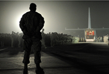
On second thought, have something representing a ramp ceremony. Etched on the wall, as a statue, or something else.

I propose this one:

View attachment 65239
That could be done with false perspective - imagine an area limiting the area from which people could view it, like a frame to that picture, with a sculpture of the troops - including the chappie in the foreground - and the Herc receding into the distance, and lit the same way.

Names could be listed around the sides of the "frame".

You could have saved us taxpayers a ton of money wasted to date and ended up with a real monument, you silly boy. Why did you not get involved a year or ten ago, or however long this has been crawling along/festering?
 
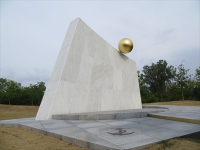
Given that the people picking the design will be the same sorts of folks who picked this for the Navy Memorial in Ottawa, I suspect that something totally meaningless will "win."1621628295369.png
 
Yeah. Although the PFS studio one (the black-walled walkway) reminds me of the US Vietnam War Memorial, which I like.
I remember a TON of opposition to the design of the Vietnam memorial when the drawings were first released, but it really is quite moving, and more and more people have said so over time.
 
A simple place for quiet contemplation and reflection is first and foremost what I would like.

I find the Hapa layout too busy (for lack of a better word); the Lashley proposal seems targeted towards architects with design choices that seem empty (to me); as already noted, the PFS design overly derivative of Maya Lin's Vietnam memorial; the Stimson design feels too cut off from everything around it.

I find the Daoust proposal to be my preferred choice.
 
Did you notice how there was no choice for free-form comments. Just - pick one of these monstrosities so that we can say we consulted the public. I'll be sending an email as well.

🍻
 
The Stinson one sucks the least, but that's the best I can say. It does, at least, propose to have the names and years of the fallen. I would like to hope the sculptor would reference helmets and load bearing equipment accurate to what we wore.
 
I remember a TON of opposition to the design of the Vietnam memorial when the drawings were first released, but it really is quite moving, and more and more people have said so over time.
Yes, and kept that in mind as I looked at them all.
 
Did you notice how there was no choice for free-form comments. Just - pick one of these monstrosities so that we can say we consulted the public. I'll be sending an email as well.

🍻
Yup.
 
You'd think that with a perfect example of what a war memorial should look like just down the street, they would have been able to come up with something appropriate. Of the choices, the Stimson one is the best in my opinion, but the tacvest and helmet need fixing.
 
A simple place for quiet contemplation and reflection is first and foremost what I would like.

I find the Hapa layout too busy (for lack of a better word); the Lashley proposal seems targeted towards architects with design choices that seem empty (to me); as already noted, the PFS design overly derivative of Maya Lin's Vietnam memorial; the Stimson design feels too cut off from everything around it.

I find the Daoust proposal to be my preferred choice.
Quite like the Daoust proposal as well, out of the available options: the stone openwork seems like a regional touch (not sure if used in Afghanistan specifically, though). Would also lend itself to adding statuary at some point.

The PFS design seems likely to collect leaves, runoff, and trash, as well as being derivative of a fairly unique design. The Lashley one feels like too many possibly good ideas in one place and broken up in a bad way: odd that they used what looks like a Hesco barrier motif in a spot not visible in any of the proper approaches to the monument (1:06 in the video). Not sure how well the arid CADPAT paving would hold up, either.
 
Back
Top